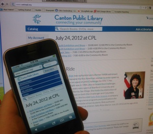
The Canton Public Library's Site Automatically Optimizes For Mobile Devices
Smartphones can be great tools for getting directions in unfamiliar neighborhoods, posting to social media sites, or even reading ebooks. But, most smartphone users would surely agree that using these small-screened devices to surf the web is frequently a frustrating experience. Websites that aren’t optimized for mobile devices will load with tiny text and tightly-placed links. Enlarging the text often results in an experience where readers are forced to scroll from side to side. And when links are close together, it can be a challenge to tap the right one, leading users away from the pages they’re trying to access.
Libraries should consider this more than an aesthetic issue, since there is evidence that the smaller the tablet or mobile device, the less people tend to browse the web, according to a recent blog post by leading interface designer Luke Wroblewski, who cites data collected by electronista.com. Ten-inch tablets like the Samsung Galaxy tab averaged 125 page views during the month of February 2012, while nine-inch tablets like the iPad averaged 116. Seven-inch tablets averaged 90 page views, and 5-inch tablets averaged only 79.
“What could be behind this precipitous drop in page views?” Wroblewski asks.
Wrobleski connects the dots, pointing to a recent analysis of the Kindle Fire by useability expert Jakob Nielsen. Nielsen was very critical of the 7-inch tablet, which he tested with a focus group of four users.
“The most striking observation from testing the Fire is that everything is much too small on the screen, leading to frequent tap errors and accidental activation,” Nielsen writes. “You haven’t seen the fat-finger problem in its full glory until you’ve watched users struggle to touch things on the Fire.”
The same is likely true for web browsing. Sites that aren’t optimized for small devices may frustrate visitors and discourage regular visits, even as mobile devices are becoming the primary Internet access point for a growing number of their users, according to an analysis of Internet use on mobile phones published by the Pew Internet and American Life Project in June.
There are several solutions to the problem, including developing or buying a library-specific app for patrons to download; developing a separate website designed for mobile devices and redirecting mobile traffic to that separate site, as the Free Library of Philadelphia and others have done; or developing a single website using Responsive Web Design (RWD) techniques.
Responsive Output
At the Canton Public Library (CPL) in Michigan, Digital Resources Developer Brad Czerniak was inspired to experiment with RWD techniques in 2010, after reading an influential article by designer Ethan Marcotte. Developers should be using CSS3 media queries to design sites that “actually inspect the physical characteristics of the device rendering our work,” and adapt accordingly, Marcotte argues.
Since that summer two years ago, CPL’s site has been designed to adjust and optimize based on the size of the device being used to access it.
“I feel strongly that Responsive Design is the future of the web,” Czerniak said. “Responsive sites support unity, while ‘mobile sites’ and platform apps cause fragmentation. We have one website for one audience: our patron community. If someone visits the site, whether from a desktop computer at home or a smartphone in the park, they can expect the same content. Any given page can always be accessed at the same web address, regardless of device. Clicking/tapping from a web search takes the user directly to the site, rather than a redirect or some annoying prompt to download an app. Responsive sites work the way you intuitively expect them to.”
Rollout of the newly designed site was quiet, and the responsive features aren’t trumpeted to patrons. But Czerniak said that they have “received feedback from patrons who are pleasantly surprised that our site is so easy to use on their mobile devices.” Mobile visitors accounted for about 10 percent of all site visits in June 2012, he added.
“The biggest challenge for responsive sites is achieving balance; designing a site to suit its content rather than the screen size of every conceivable device,” Czerniak wrote in an e-mail. “Ideally, a design starts small (for screens on devices that have low bandwidth and limited processing power) and then scales the layout and visual elements to suit larger viewports. Since we had an existing site design for desktop machines, our design starts big and adapts down to small screens. Future iterations of our site design will likely incorporate ‘mobile first’ principles to further improve the user experience across a wide range of devices.”
The Mobile First approach argues that “we should not be developing mobile sites as an afterthought or an addendum to our full, or desktop, sites. We should actually consider the needs of mobile users first, and then add on beyond that. We should design primarily for the mobile experience,” Nina McHale, assistant systems administrator for Arapahoe Library District, explained during the “Top Technology Trends and LITA Awards Presentation,” session last month during the ALA Annual Conference in Anaheim.
McHale, a 2012 LJ Mover & Shaker, chose Mobile First and Responsive Web Design as her top trends for the year, and citing Wroblewski, she explained that mobile users tend to access the web for four different types of activities. They want to look something up or find something; explore or play online games; check in with friends or post a status update; or edit and create something.
As LJ summarized after the panel, “designing with an eye toward those activities, a library mobile site might include a branch finder or catalog site search, a readers advisory app, a way for patrons to review checkouts and see if they have any fines, and a way to comment on a library’s webpage or write and submit reviews, McHale suggested.”
Mobile in Philly

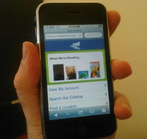
The Free Library of Philadelphia Has Offered a Mobile Site Since 2009
Whether utilizing responsive web design techniques, or simply designing a separate, standalone website optimized for small screens, mobile websites not only offer casual users a better browsing experience, they can also help bridge the digital divide.
The Pew survey found that 17 percent of respondents said that they do “most” of their online browsing using their phone. Many of these people use their phones out of convenience, but for some “their phone is their only option for online access.”
In Philadelphia, where up to 55 percent of households lack a home computer, The Free Library of Philadelphia has been responsive to such numbers. Since 2010, the library has been a managing partner in the “Freedom Rings Partnership” (FRP). Through this grant and funding from the John S. and James L. Knight Foundation, the Free Library has been able to set up ‘Hot Spots’ in six community organizations and to launch a Techmobile (in spring 2012) to bring computers, Internet access and one-on-one assistance to neighborhoods where there is limited computer access, such as public housing developments, according to Anne Silvers Lee, chief of the Free Library’s Materials Management Division.
But the Free Library has also made fast and easy mobile access a priority by offering free mobile hotspots and, since 2009, a standalone mobile website that is easy to read and navigate on phones.
Three years ago, the library began by launching a mobile version of its catalog that offered users the ability to search for books and other materials, place holds, and perform select “My Account” functions, Silvers Lee said. A few months later, the mobile site was expanded to include the most heavily-used areas of the regular website, including full access to My Account, a branch finder, an event calendar, links to e-content, blogs, staff book reviews, and featured booklists, podcasts, links to social media content, and more.
“During June [2012], about 4 percent of the visits generated internally came from mobile devices, while about 16 percent of the external visits were from mobile devices,” Silvers Lee wrote in an e-mail put together with input from other Free Library staff. “All of the mobile pages combined received 73,473 pageviews, which is pretty consistent with previous months. The most popular functions, in order of use, are the event calendar, the catalog/My Account functions, the branch pages, the clickthrough to our Overdrive content, and the podcasts. We have also been providing a ‘Text a Librarian’ service for a couple of years now.”
Future plans for the mobile website include updating to HTML5 and designing “a more interactive, fluid, and ‘app-like’ experience; adding more content from full website (such as booklists, FAQs, and so on); and creating a mobile layout for our VuFind catalog discovery installation,” according to Silvers Lee.


Great article, Matt. You offer valuable information for Libraries thinking about embracing new technology.
A couple things to consider when trying to figure out if your library needs an app:
Many mobile Web users are mobile-only, i.e. they do not, or very rarely also use a desktop, laptop or tablet to access the Web, according to On Device Research.
1 in 3 mobile searches are local – after looking up a local business on their smartphone, 61 percent of users called the business and 59 percent visited, according to Think Mobile with Google.
The Fayetteville Public Library has an Android, iPhone & iPad App as well as a Content Management System built by Hybrid Forge (www.owlilibrary.com). Fayetteville’s patron base quickly adopted and embraced Owl with over 200+ new installations of the apps each month. January (2012) alone saw over 4,000 mobile PAC sessions from the iPhone app alone!
Here is a news clip on Fayetteville’s adoption of mobile technology. http://hybf.org/cp
For more information on Owl iLibrary Visit: http://www.owlilibrary.com