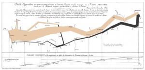
 Given the ubiquity of infographics on the web today (according to one account they have increased 1200% in three years), you can be forgiven for thinking that they are a new phenomenon. They aren’t. Infographics have actually been around for quite some time, as Edward Tufte pointed out with his popularization of one of the best infographics of all time (see pic and link): Charles Joseph Minard’s portrayal of the losses suffered by Napoleon’s army in the Russian campaign of 1812.
Go ahead and take a look. Study it. I’ll be here when you get back.
Do you see what he did? He took raw data and made it communicate visually. Let me re-iterate this, as this lesson is too often lost in present day “infographics”. You receive information immediately, without reading it. The minute you understand that the width of the line equals the relative number of troops, you are stunned. The depth of the tragedy has been communicated — if not fully, at least by impression.
The Menard infographic also combines several different planes of information, from troop strength, to temperature, to distance. It is, frankly, brilliant. I’m not suggesting that every library infographic needs to be brilliant, but nearly all of them can be smarter than they are. Either that, or give up the attempt. Seriously.
It’s sad, but many contemporary infographics are hardly anything more than numbers and clip art — often with only a tenuous connection between them. We really must do better.
Minard’s early infographic ably demonstrates the best qualities of an infographic presentation:
- Information is conveyed at a glance. If you must read a lot of text to get the drift of the message, then you are failing.
- The whole is greater than the sum of its parts. Menard deftly uses all of the dimensions of a piece of paper to convey distance, temperature, and troop strength all in one graphic. The combination puts across a message that any single element could not.
- There are layers of information that are well integrated in the whole. An initial impression can be conveyed, but your graphic should also reveal more information under scrutiny.
Unfortunately, library infographics rarely, if ever, even loosely achieve these aims. Humor me, and do a Google Images search on “library infographics” and see what you get. Mostly they are simply numbers that are “illustrated” by some icon or image. They really aren’t infographics of the variety that Tufte champions. They are, unfortunately, mostly pale shadows of what is possible.
So let’s review some of the signs of a bad infographic:
- Numbers are the most prominent thing you see. If you look at an infographic and it’s only numbers that leap out at you, stop wasting your time. Move on.
- The numbers are not related at all. Many library infographics combine numbers that have no relation to each other. Who wants to puzzle out the significance of the number “30” next to the number “300,000”? Not me, nor anyone else.
- The images are only loosely connected to the numbers. Stop putting an icon of a book next to the number of book checkouts. Just stop.
In the end, it’s clear that libraries really need professional help. Don’t think that you can simply take numbers, add an icon, and create a meaningful infographic. You can’t. It’s stupid. Just stop. If we can’t do this right, then we shouldn’t be doing it at all.


“The images are only loosely connected to the numbers. Stop putting an icon of a book next to the number of book checkouts. Just stop”
Roy, I am so with you on this. I have seen so many presentations, posters, etc by librarians with redundant images that add no value. Majority of my librarian colleagues vehemently justify that they are necessary with very weak reasons. Almost laughable. E.g. “But don’t you think this picture is SOOOO cute?”; “But I just *feel* this image is important”; “Without the image, the whole thing looks too blank, that’s not acceptable”.
We are still the minority Roy, the number of librarians with a preference for what you’ve listed as “signs of bad infographics” are just too way many, and many of them in senior positions.
I hear you, but I will not stop fighting the good fight. I’ve lost many a good fight in the past, but I can’t ever give up hope that things can’t be improved. Call me a hopeless romantic.