Plop down a large data set in front of most students and their eyes are likely to glaze over. How do they begin to make sense of it? Simply re-presenting that content in the form of charts or maps can make it more accessible. Likewise, asking students to analyze large passages of text may elicit eye-rolling. But put that same text into a word cloud and your students may very well launch directly into a related discussion.
Creating data visualizations and word clouds is quite easy with the following tools.
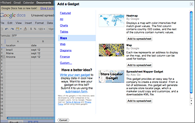
If you’re a Google Documents user, you already have some good data visualization tools at your fingertips. In Google Docs spreadsheets, there are many gadgets that you can install from the Insert drop-down menu. In the gadgets menu, you’ll find options for creating motion charts, heat maps, time lines, tree maps, and word clouds. From that same Insert list, you can also choose to generate various types of charts from the data in your spreadsheet.
Teachers who use multiple choice quizzes should know about another feature in Google Docs spreadsheets: a script called Flubaroo. Accessible under the Insert menu, Flubaroo will automatically grade multiple choice quizzes for you.
Another helpful product is Google Fusion Tables. At its most basic level, Fusion Tables can be used to present existing data sets in a visual format with one click. At a deeper level, Fusion Tables can be used to compare your own data sets and create visualizations of those comparisons. The types of graphics you can make include tables, maps, charts, and graphs. As a social studies teacher, I gravitate toward the map visualization options.
Free service Hohli Online Charts Builder lets you create 14 different styles of charts, including pie, bar, line, and scatter formats. Simply copy and paste your data into the chart or enter it manually. Then you can edit the fonts and overall size of your graphic. One nice thing about Hohli is that you can see instantly how each new piece of data you enter influences your chart. Download your completed graphic or use the embed code to display it in your blog or website.
Many Eyes is an online data visualization service developed by IBM. Here you’ll find tools for creating a wide variety of graphic options using your data sets or those hosted by IBM. If you’re not interested in creating visualizations, but just want to explore the creations of others, you can do that on Many Eyes, too. Six categories of data visualization on the site range from “See relationships among data points” (e.g., scatterplotting) to “Track rises and falls over time” (line graphs). You’ll also find some unusual and more complex displays such as tree maps, block histograms, bubble charts, and phrase nets.
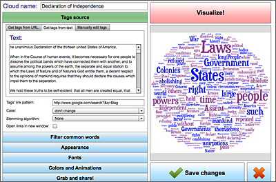
Word cloud generators abound on the Web. The one best known among educators is Wordle, but my preferred tool in this category is Tagul. What makes it so special? When you create a word cloud with Tagul, every term is linked to a Google search. Simply click on any term in your graphic, and you’ll be taken directly to a Google search results page for that word. To create a word cloud, enter text into your Tagul account. The service will also generate a word cloud from any URL you specify. As with some other word cloud generators, Tagul lets you omit specific words in your final creation.
For educators whose schools allow the use of cellphones, Poll Everywhere added a new word cloud service last summer. Poll Everywhere, a service I reviewed in this column last fall, allows you to use cellphones for instant anonymous responses from an audience. The new word cloud option in Poll Everywhere allows you to create word clouds of audience responses using Tagul, Wordle, or Tagxedo within your account’s administrative panel. Creating word clouds of student responses to an open-ended question could be a great way to quickly determine the most popular phrases used by your students for prompts you’ve given to them.
The next time you’re faced with presenting a large data set or text passage, consider giving the information some visual flair using these services.


[…] content or both. In librarydom you may have seen infographics mentioned in Library Journal’s Digital Shifts, in this issue of AL Direct, and in this YALSA blog. Many of the tools mentioned by these sources […]